Experiment
Florida Politics
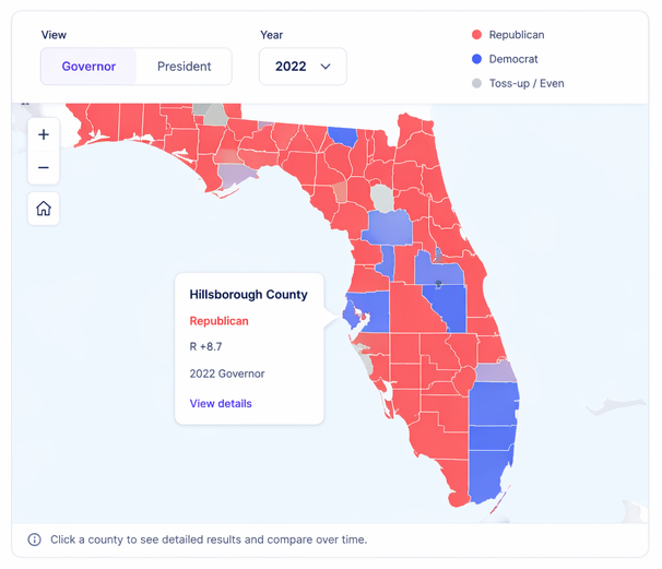
An interactive map showing how political control shifted across Florida counties over time.
What it shows
All 67 Florida counties, colored by the winning party in each election.
Step through elections from 1994 to 2022. Animate or jump to any year.
Toggle between gubernatorial primary and general election results.
Combined House + Senate party control, charted from 1992 to present.
Click any county for detailed results and a comparison across elections.
Insights from the data
14 counties always voted blue
14 counties voted Democratic in every contested gubernatorial primary on record — including years when Republicans ran competitive races. These include the state capital (Leon), Florida's largest university town (Alachua/Gainesville), majority-Black counties in the historic Black Belt (Gadsden, Jefferson, Madison, Hamilton), and South Florida population centers (Broward, Palm Beach).
Alachua · Broward · Calhoun · DeSoto · Franklin · Gadsden · Hamilton · Jackson · Jefferson · Leon · Liberty · Madison · Palm Beach · Taylor
20 counties always voted red (when contested)
No county voted Republican in every election in the dataset — because the 2002 and 2022 Republican primaries were uncontested, leaving only Democratic primary votes to color those maps. That's a data artifact, not a political shift.
In the five years when both parties held contested primaries (1994, 2006, 2010, 2014, 2018), 20 counties voted Republican every time — suburban Central Florida, the Gulf Coast, and the Space Coast.
Brevard · Charlotte · Clay · Collier · Flagler · Hernando · Highlands · Indian River · Lake · Lee · Manatee · Marion · Martin · Okaloosa · Pasco · Pinellas · Sarasota · Seminole · St. Johns · Volusia
Notes from the experiment
- Data sourced from the Florida Division of Elections and Ballotpedia. Normalizing 30 years of inconsistent CSV formats was most of the work — election years have different column layouts, encodings, and candidate name formats.
- 1998 is excluded from the county map. Both primaries were uncontested that year, and available data was found to display general election results mislabeled as primary data. Legislature data for 1998 is still included in the chart.
- Uncontested primaries (2002 and 2022 on the Republican side) produce misleading solid-color maps. The app uses a threshold and labeling to flag these cases rather than color them as decisive wins.
- The playback animation required separating the D3 update loop from React's render cycle. Tying them together caused jank on older hardware — decoupling them and batching the state updates resolved it.
- County boundaries from US Census TIGER/Line data, simplified with Mapshaper. Raw GeoJSON was too large for acceptable load time without noticeable loss of map fidelity at the chosen simplification level.
- The biggest geographic story in the data isn't in the primary map — it's in the legislature chart. Republican legislative dominance built steadily from the mid-90s onward while the gubernatorial map stayed genuinely competitive much longer.
Related work

Project
Work Radar
A local-first desktop app for tracking job opportunities, scoring fit, and managing the full search process.
View project
Experiment
Where Now?
A random food and trip generator for the Lisbon area. Built for the moment when indecision wins.
View experiment